In episode 1 - MQTT - Raspberry Pi - Mosquitto and Node -Red we installed Node-Red and the MQTT server Mosquitto on the Raspberry Pi. In episode 2 - An ESP8266 as a MQTT client and episode 3 - Expansion of the MQTT-Home system Created two MQTT clients with the ESP8266 and a monitor with an ESP32 for control and monitoring the system. Today we will create a graphical web interface with a very interesting tool that significantly simplifies dealing with MQTT.

Figure 1: This is how it should look when it is finished
After all, it doesn't make much sense to reinvent the wheel for the umpteenth time. So welcome to this part of the series.
4. Node-Red and MQTT
Before we can really get started, we take a look at the surface of Node-Red. So if we turn on the Raspberry Pi, Node-Red should automatically start up according to the settings in blog post 1. If this is done, we start a browser on the Windowskiste. I have had good experiences with Chrome. Of course, at least one of our ESP8266 clients must also be started to feed the broker. Both run for me and I will first integrate the DHT client into Node-Red first.
The Node-Red window is divided into three areas, the node selection (palette), the work area, called Flow and the area for displaying the properties (Properties) in the right-hand column. Nodes are icons, behind which you can imagine a function that fulfills a very specific task. Some nodes have inputs, they correspond to the input parameters in functions. Other nodes have only one output, comparable to the return value of a function. Many nodes have inputs and outputs and all have more or less properties that can be edited.
There are five riders in the side column with which different things are displayed. Information about the nodes in flow, help to the nodes, the debug window, configuration nodes and context data.
The menu is hidden under the symbol with the three crossbeams. To the left is the button for publishing the flows, almost the start button for the program.

Figure 2: Node -Red - window areas
You create a flow by pulling nodes (nodes) out of the palette into the work area and connecting lines. Let's try it out right away. We click on the "in the Property column"I"For info, then we pull one MQtt-in-Node from the rider network in the work area.

Figure 3: Network MQTT-in
Then we get a debug node from Common and make a connection to the entrance to the entrance of the debug icon to the right of the output of the MQTT icon.

Figure 4: MQTT with Debug-Node
The property window now looks like this.

Figure 5: MQTT properties
Of course, we have to tell the MQTT-NOD which broker which topic should be subscribed to. So we have to adjust the properties of the nod correctly. To edit, we click twice on the MQtt-in-Icon.
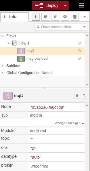
Figure 6: MQTT Properties
We edit the four fields in turn server, Topic, output and Surname. To adjust the broker, we click on the pencil.

Figure 7: Add the broker
The IP address of our Raspi comes into the field of Server, the port remains in 1883. We write as a name Raspi. After clicking on the left, we are back in the machining window of the MQTT node. We enter the topic, choose from the list of output a string and give the connection the name Mosquitto - Complete.

Figure 8: MQTT properties filled out
A look at the properties window shows the last settings. Then we switch by clicking on the rider with the bug in the side column to the debug window and click on the deploy-Button. If then Successfully implemented we did everything right.

Figure 9: Successfully implemented

Figure 10: The first temperature values from the DHT client
Look there, a new temperature value from the DHT client appears every 5 seconds in the debug window. Looks good, it works!
But we wanted a beautiful graphic user interface with display devices and switches. Well, let's add the desired nodes of our palette, because you are not included in the existing pool.
We guide the expansion via the menu entry Manage the palette through.

Figure 11: Manage the palette
We choose the rider To install, give in the search field node-red dashboard one and start on the right when the package is displayed to install. A message appears. Before you click again to install is acknowledged, it is recommended to click the information button. It leads to a website where the new nodes are explained. The facility is done after about 15 to 20 seconds.

Figure 12: Install Dashboard

Figure 13: Start dashboard installation
After completing the installation, we end the process with left -clicking close. In the palette we can now find the new rider Dashboard. There is a lot more in here than we need at the moment.

Figure 14: Node -Red - Dashboard Nodes
Some information about the construction of the node-Red window in front. The widgets or nodes are best organized in groups in groups, which in turn are subordinate tabs. Both your own groups and your own tabs can be created. By specifying the width of the groups, you can influence how many of them are shown side by side. We will now be the group basement, cellar in the tab Home assistant In the same train with the first gauge-Widget, a pointer display unit.
We mark that Debug-Node, Delete him with the Develop-Button and pull one Gauge-Node from the folder Dashboard on the work surface. A double click on it opens the editor window to define the properties.

Figure 15: Edit Gauge -Node - Add group
At Group Opens a click on the Pen Another window to the right of the field.

Figure 16: Edit Gauge-Node-Add Group-Node
And again we click on the pen, because a tab must be set up before we can place a group in it. We overwrite home with Home assistant and click on Add to.

Figure 17: Edit Gauge-Node-Add Tab-Node
We end up in the window to add the group, which we are now the name Basement temperature give. With a hook we allow the group to be folded together, i.e. can be hidden and close the window with Add to.

Figure 18: Edit Gauge -Node - Add group name
Back in the Gauge-Node window, we first set the size of the display in grid units. The remaining information can be seen from the subsequent illustration.

Figure 19: Edit Gauge -Node - Determine the size of the display

Figure 20: Gauge -Node edited - done
click on Ready Ended the adjustment of the properties. In the Flow 1 If the small red triangle on the Gauge-Node has now disappeared, indicating that the widget was not yet configured. Instead of gauge Is the name now Cellar temperature entered.

Figure 21: Back in the flow
The window Configuration node shows us a summary of our last measures. From here you can also edit its properties by double -clicking on the corresponding entry.

Figure 22: The new configuration nodes
The change to the dashboard column shows the hierarchy of the previous nodes.

Figure 23: On the dashboard view

Figure 24: Dashboard hierarchy
Well, a test is now announced after so much action. So - deploy And click on the marked button with the diagonal arrow. - Wow!

Figure 25: Display of the cellar temperature
If we want to check the behavior of the display for other temperature values, we do not necessarily have to put the DHT client in the freezer or ignite a fire underneath. No, it is enough if we open a terminal to the Raspi and send the following commands. Observe the temperature display.

Figure 26: This is how we test other temperatures
Until the next automatic update of the temperature through the DHT client, our factor value is displayed. The broker doesn't matter what he receives and passes on, he has no idea who published the message. He gets the message and passes it on to Node-Red, done. You think that's a very bad security gap? Wherever you are right you are right! There are several approaches to close the gap, but that leads too far at the moment and is the topic for its own blog episode. We still have a lot to do until our application is complete.
A new mqtt in- node and another gauge-Widget flies on the work surface and are connected.

Figure 27: The moisture comes into play
This time the configuration is faster. The server is already known, topic and name are added - Ready.

Figure 28: Relative air humidity - MQTT -NODE Properties
The Gauge-Node is not quite as fixed. Because the two ads should appear side by side, we have to assign a new group to the moisture node.
Double-click on the Gauge widget brings us to the properties window.

Figure 29: Edit Gauge -Node - generate a new group
To create a new group, we open the list and click with the selection New Add ui_group On the Pen. Enter the name, Allow group reduction and Add to.

Figure 30: Edit Gauge -Node - Properties of the new group
The remaining properties follow from the illustration again - Ready.

Figure 31: Edit Gauge -Node - Properties of the Display
You can also experiment with the colors. With Sectors Incidentally, you can specify the positions where the color envelope should take place exactly. Without this determination, mixed colors are generated, the color change is soft.
The flow must be deployed again for the test. The blue dots on the nodes indicate that these nodes have not yet become deplroyed again, or after changing the properties. Now let's just switch to the dashboard window of the browser, it should still be open.

Figure 32: Both advertisements in the dashboard
Of course, the hygrometer can also be tested via the terminal window.

Figure 33: Hygrometer test
Now the fan is still missing and feedback on the success of the campaign.

Figure 34: Switching and feedback of the fan
The widgets switch and text Living in the dashboard palette, MQtt-in and MQTT-out are in network at home. We bring you to the work surface. The two flows come in a new group named Cellar fanthat we create like the second Gauge widget. On Payoad is sent when the switch is switched on. We send one String in fact "at". Analog we treat Off Payoad. The statement of the topic is important and the name rounds off the whole - Ready.

Figure 35: Switch-Node Properties
This is what the switching campaign looks like - Ready.

Figure 36: Publisher-Node for the switch
With the MQtt-in- We pick up Node about the switch position from the DHT client.

Figure 37: MQTT Switch Subscriber Properties
And here is the properies of the text nodes - Ready.

Figure 38: Text-node properties
Then deploy And "Look, then see Mer Scho" (F. Beckenbauer), change to the dashboard window.

Figure 39: DHT client finished
Back to the Node-Red window. The dashboard card shows what we have done so far and it hides a secret.

Figure 40: The dashboard card shows the connection
If you drive with the mouse over the tab line, further buttons appear. We can add a group, edit the existing tab and the Arrangement of the groups change. But that's not all. The entries can be moved with the mouse via drag and drop. This changes the order in the dashboard window. The shift of flows to other groups is also possible, and the vertical position in the window can be changed via layout.

Figure 41: Group arrangement before adjustment
The buttons +tab and +group, with which other tabs and groups can be created, are interesting, which can then be accessed when selecting in the dashboard widgets.
If you no longer have a use for a group, it cannot be deleted from the map. You have to click on Edit. In the top of the properties at the top left, the button is hidden for deletion.
We are almost at the end of today's episode. One thing is still missing, the export of the entire work. We choose via the menu Export.

Figure 42: Menu Export
We copy the formatted JSON code into the clipboard and import it into a new, empty window in Thonny. From here we save with any file name.

Figure 43: Copy in the clipboard
You can also download the text as a file with download. He then ends up in the folder that is set as a download folder in the browser.
Another little thing as a gourmet. Don't you like the given colors? Not bad, simply forgive colors of your choice for the various objects. You can reach the editor via Dashboard - Theme - style - user -defined.

Figure 44: Create a custom theme

Figure 45: custom colors
As a homework, you will now easily manage to expand the dashboard with the following features.
- A new tab Heating
- Preliminary and return temperature in a new group Temperatures in Heating
- Switch for burners and pumps including feedback in a new group Switch in the tab Heating
- Add a chart widget in the cellar temperature group to plot the temperature over 24 hours
Oh yes, that JSON file Today's project is available for download. Open the file, for example, in Thonny, mark the text (Ctrl + A) and copy it into the clipboard. In Node-Red, import it through Ctrl + I and Ctrl + V. A lot of fun programming, trying out and discovering.

Figure 46: homework




2 comments
Jürgen
Hallo, Herr Waage,
Hier ist der gewünschte Link zur PDF-Datei:
http://www.grzesina.de/az/mqtt/node-red-dashboard_ger.pdf
Gunther Waage
Auch der 4. Teil dieser Serie ist eine perfekte Arbeit.
Sicher wird der Eine oder Andere dieses Projekt erst später durcharbeiten.
Ich würde mich auch für den 4. Teil die Möglichkeit eines PDF-Downloads wünschen, bei dem die Links erhalten bleiben.
Gruß Gunther